A 4-star Worcestershire guest house with one of the county's finest restaurants. The quality of the experience had grown considerably under new management. The brand had not.
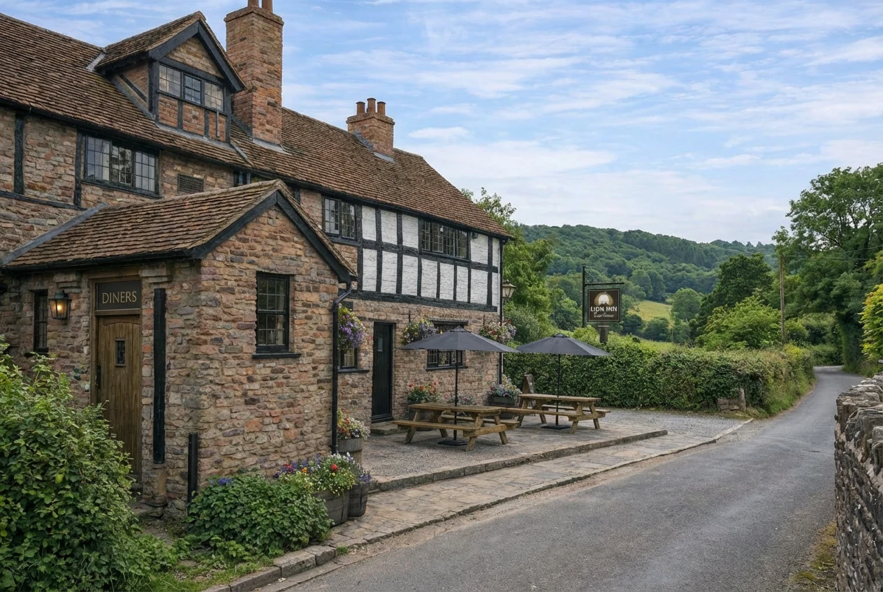
The Lion Inn sits in the rolling Malvern Hills — a place that had earned its reputation quietly, over years, through good food and proper hospitality. What it needed was not a reinvention. It needed a brand that was finally worthy of the place itself.
increase in bookings
following the rebrand and website launch
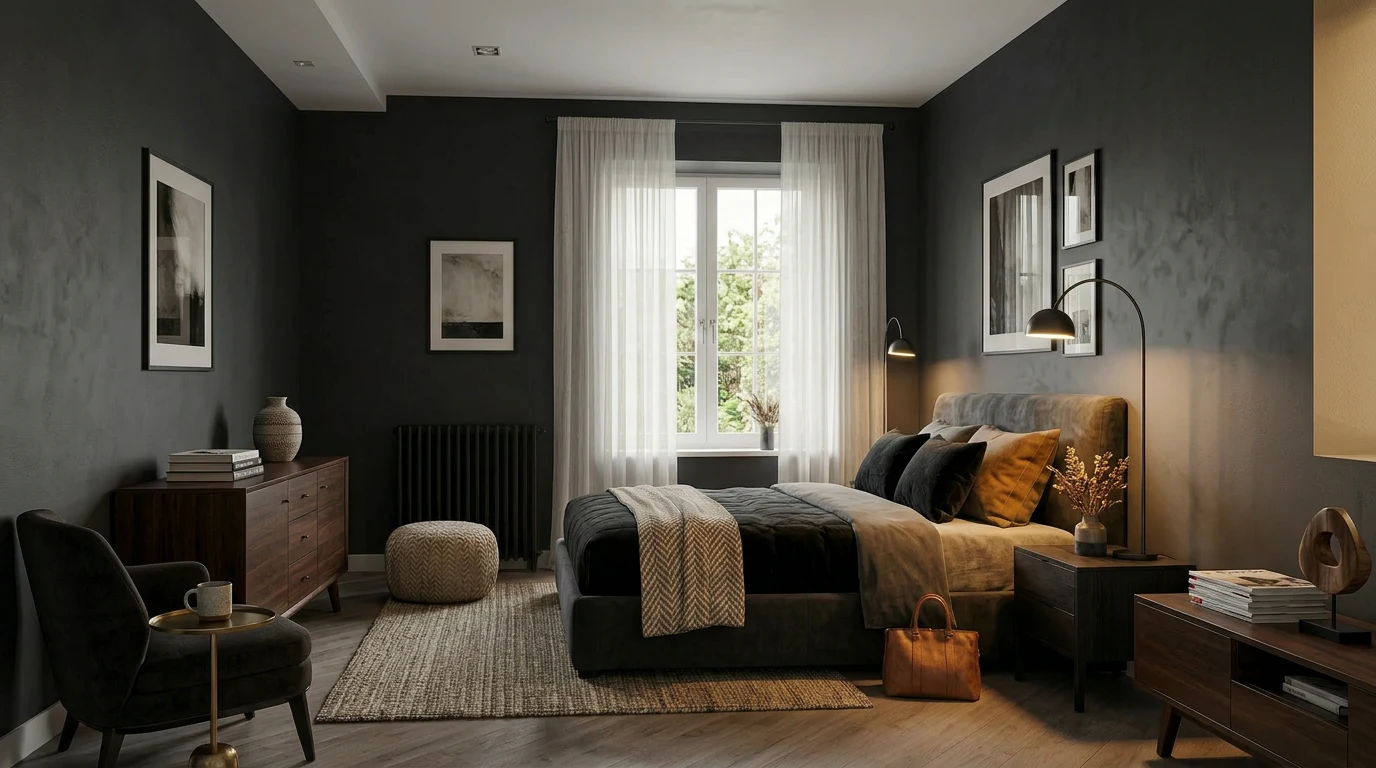
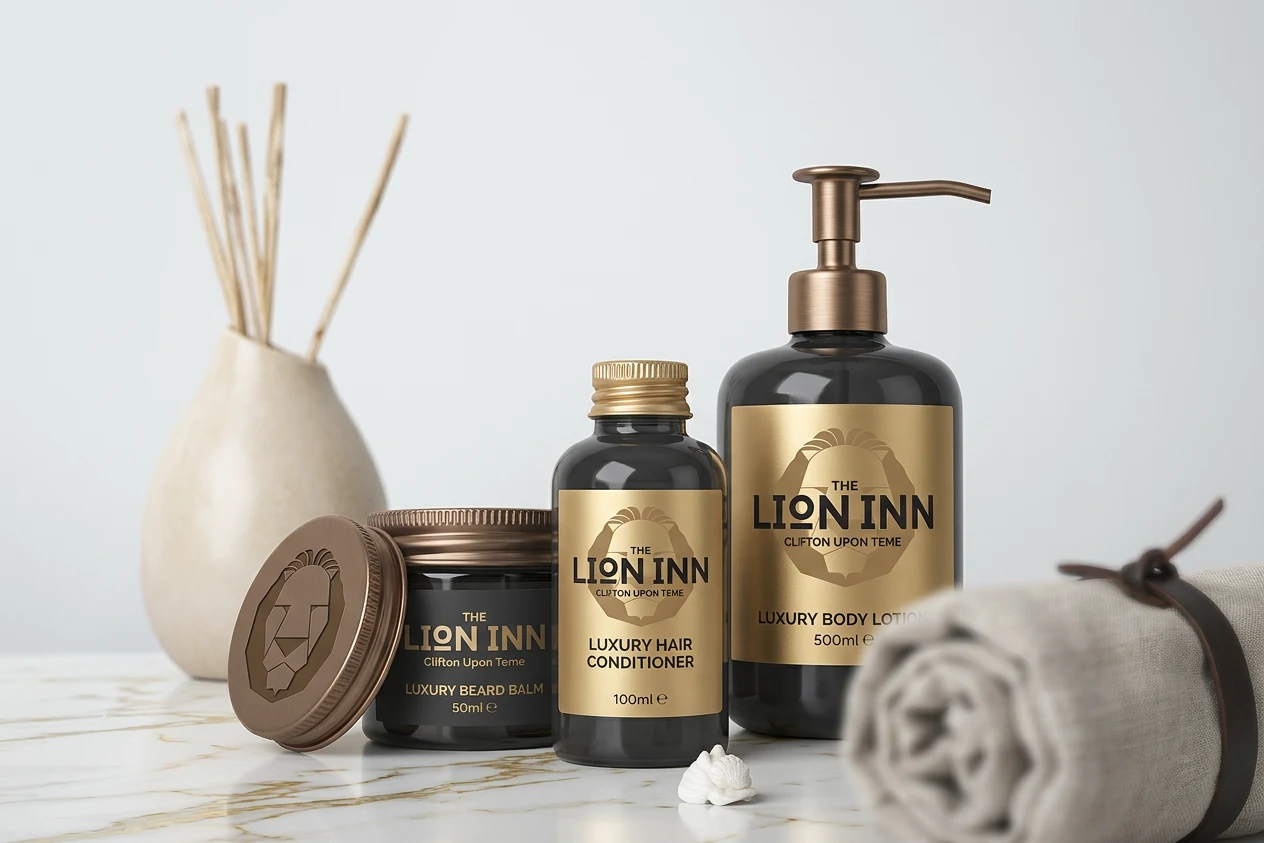
A new identity built around three principles — provenance, warmth, and elevation. Applied across every touchpoint: logo, signage, uniforms, menus, print collateral, and a new website with integrated room booking.
"Geoff was the perfect fit. From the moment we started working together I knew we were on the same page. The ideas flowed… they developed… and ultimately came together to complete a truly professional package that had myself, customers and employees suitably impressed. The process as a whole was seamless."Tom Gaunt — Managing Director, The Lion Inn
A brand for a place that had earned its reputation quietly, over years, through good food and proper hospitality.
The identity was built around three principles: provenance, warmth, and elevation. Provenance, because The Lion Inn sits in a specific, particular corner of Worcestershire — the rolling Malvern Hills — and that geography is part of what it sells. Warmth, because the experience of the place is fundamentally about being welcomed and fed well. Elevation, because the quality had grown substantially under new management, and the brand needed to say so without saying it directly.
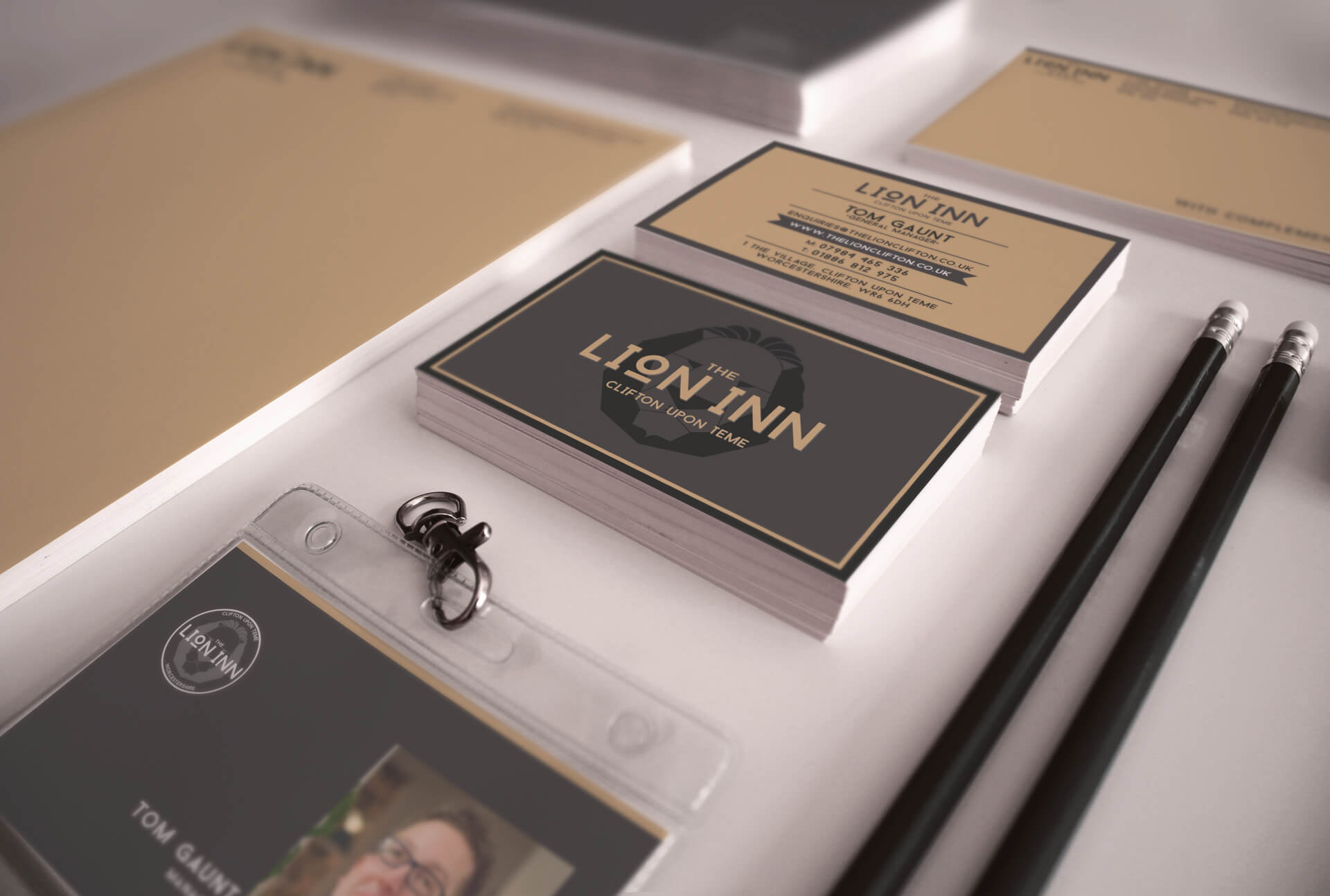
The logo mark draws on the heraldic lion — a reference to the inn's name and its long history in the village — redrawn in a contemporary hand that removes the stiffness of traditional heraldry without losing the authority. Applied to signage, uniforms, and print collateral in deep forest green and warm gold, it reads as both rooted and refined.
The website was the primary commercial priority. Rural hospitality businesses live and die by their booking conversion rate, and The Lion Inn's existing site was not converting at the rate the experience deserved. The redesigned site placed the photography and the offer at the centre — rooms, restaurant, and events — with a fully integrated booking system that reduced friction at every step from arrival to reservation.
The 30% increase in bookings following launch was not a coincidence. It was the result of a design that understood its job: to make The Lion Inn feel, to a first-time visitor who had never been to Worcestershire, like somewhere they needed to be.
The project was subsequently featured in Sandu Publishing's internationally distributed hardback series on hospitality brand design.